In this project we worked on the comprehensive development of the brand “Manos les van a faltar”, from its initial conceptualization to the creation of its complete visual identity. We designed a logo that captures the essence of mezcal, integrating elements such as hands and the maguey to communicate tradition and authenticity. The scope of the project included the creation of the identity manual, selection of fonts and color palette, and design of the bottle label.
“Manos les van a faltar” required a brand identity that captured the essence of an authentic, artisanal, high-quality mezcal. The project faced multiple challenges that affected its ability to stand out in a competitive market and emotionally connect with its target audience:
Graphically merge multiple hands with a maguey:
The main challenge was to design a logo that represented the idea behind the name, harmoniously integrating hands and the maguey as central elements of the brand.
Difficulty in conveying your unique proposition:
The concept behind the name, “Manos les van a faltar” (Manos les van a faltar) (Hands will be missing), needed to be represented visually to stand out in a saturated market and create an immediate connection with consumers.
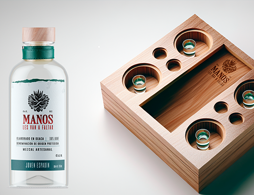
Need for an attractive packaging design:
The bottle, as the first point of contact with the consumer, lacked a memorable design that communicated the quality and character of the product.
Lack of brand guidelines:
There was no identity manual to ensure the correct application of the brand in various contexts, from printed material to digital applications.
The result
Thanks to a strategic and creative approach, we managed to develop a comprehensive identity that highlights the cultural and artisanal essence of “Manos les van a faltar”.
Distinctive logo: Creation of a unique design that integrates hands and maguey in perfect harmony, evoking tradition and originality.
Iconic typography and colors: Using a vibrant red typography and a balanced palette that combines modernity and authenticity.
Shocking tag: Design that communicates the quality of mezcal with detailed graphic elements and a clear visual hierarchy.
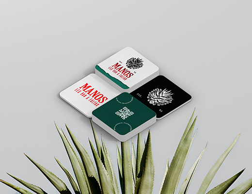
Identity manual: Development of guidelines to ensure visual consistency across all brand applications.
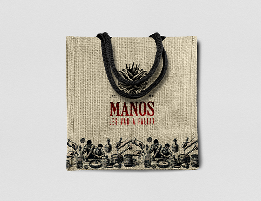
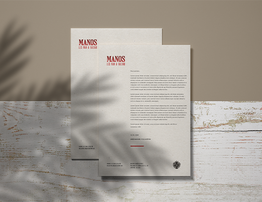
Visual applications: Creation of corporate stationery and merchandising, such as t-shirts and bags, which reinforce the brand's presence.
Please fill the required fields: Access Token
Mechanisms used
Adobe Illustrator: Used to create the base illustrations of the logo, managing to graphically merge multiple hands with a maguey in a balanced and representative design.
Photoshop and retouching tools: Applied to fine-tune visual details in logo applications and testing on mockups, ensuring a polished result on all materials.
Creating custom illustrations: Development of unique graphics that reflect the authenticity and tradition of mezcal, highlighting elements such as the textures of the maguey and the expressiveness of the hands.
Visual conceptualization: Through initial sketches and moodboards, key ideas were defined to convey the essence of the brand.
Visual prototyping: Creating multiple iterations of the logo and label, testing different styles to find the ideal design.
Printing tests: Performing physical tests to verify color fidelity and design readability in different sizes and materials.
dg
#ffa751
#ffe259
Graphic design
We create authentic and functional visual solutions: from logos to advertising materials and digital designs. If your idea needs shape, we take care of making it impactful and effective.
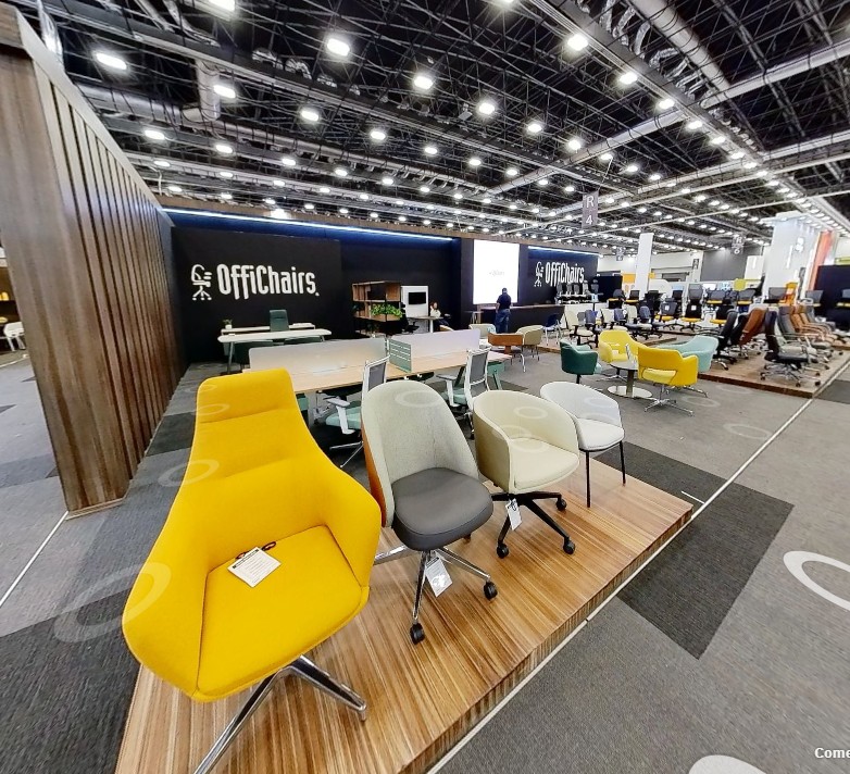
Innovación en movimiento: ¿Cómo llevó Offichairs su extensa colección de sillas más allá de la Expo Mueble 2025? Descubre cómo transformaron su exhibición en una experiencia digital que redefine la forma de explorar y elegir mobiliario
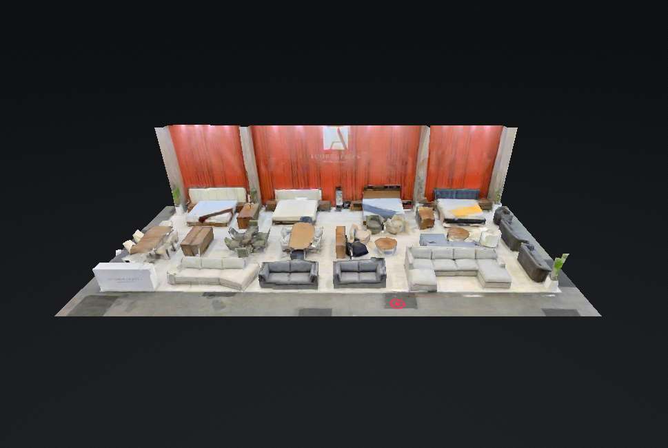
ACOR Muebles transforma su catálogo con una poderosa herramienta digital. Descubre cómo su showroom virtual está redefiniendo la manera de exhibir y vender mobiliario
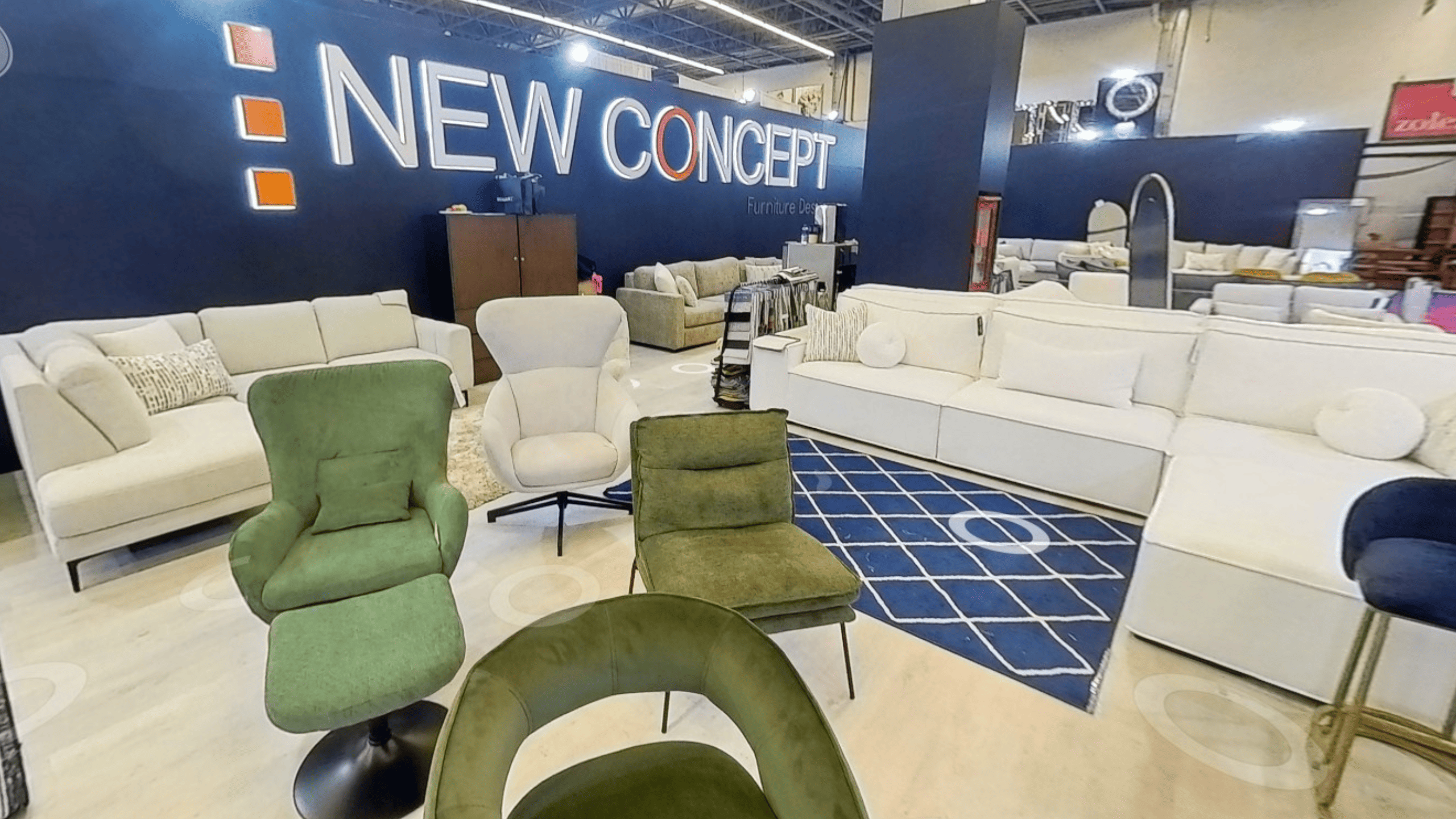
Cada edición, su creatividad cobra vida en un stand único. En 2025, esa experiencia no terminó con la expo: gracias a la tecnología de escaneo 3D 360°, su diseño y colección quedaron inmortalizados en un showroom digital accesible para todos
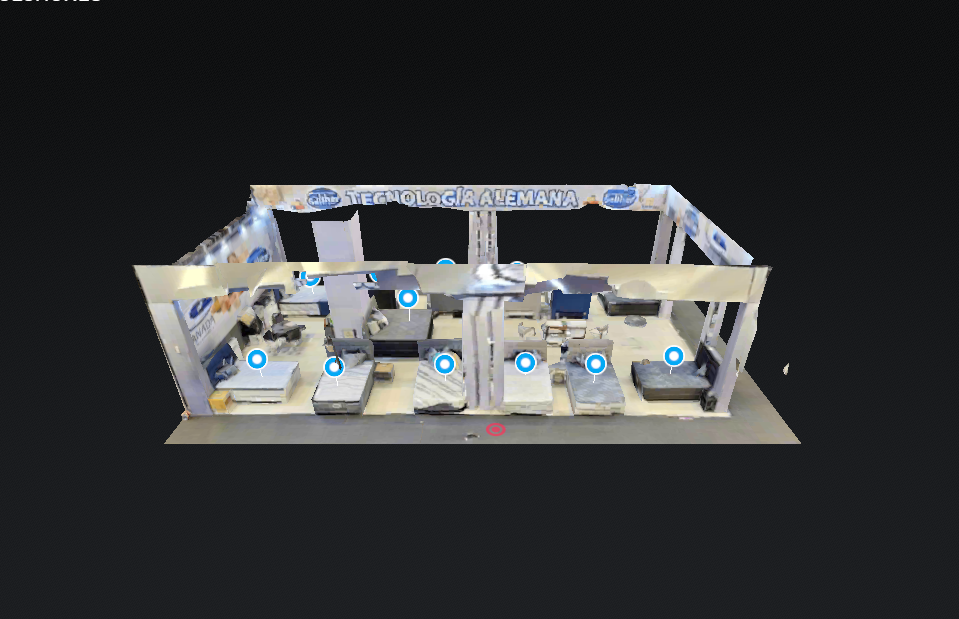
Líder en la fabricación de descanso, Colchones Canada dio un paso hacia la innovación digital en la Expo Mueble Internacional de Guadalajara 2025. Gracias al servicio E3 de Alavista, transformaron su stand en un muestrario virtual interactivo, permitiendo a los clientes explorar su catálogo desde cualquier dispositivo y facilitando su integración en su sitio web
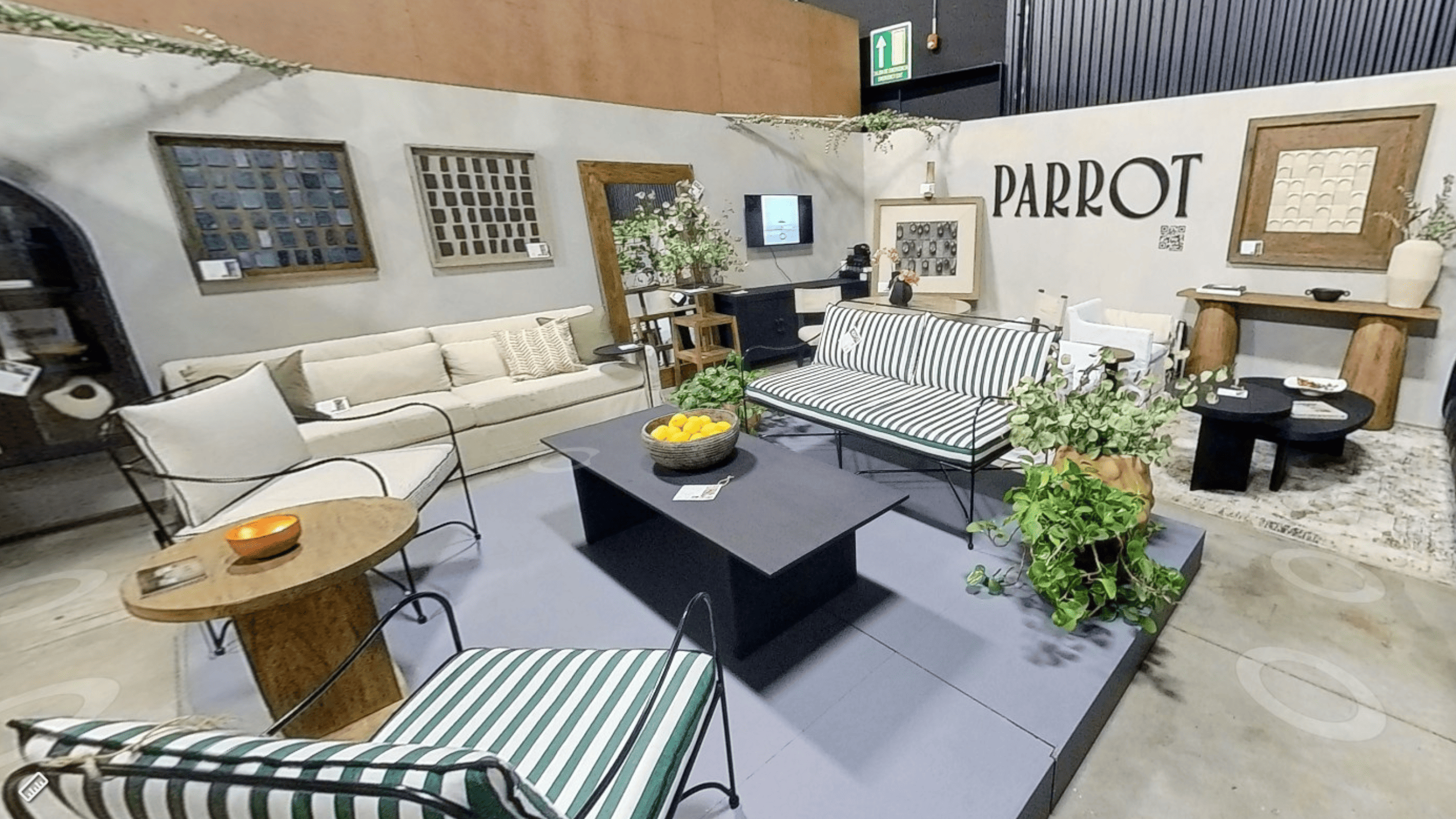
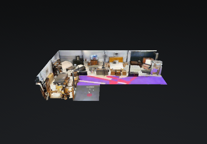
“Diseño audaz, materiales naturales y artesanía sin límites. Parrot Furniture llevó su esencia a la Expo Mueble Internacional 2025 con un stand espectacular, ahora inmortalizado en un recorrido virtual que refleja su creatividad y pasión por el detalle.”
Una marca innovadora en el diseño de mobiliario, transformó su participación en la Expo Mueble Internacional de Guadalajara 2025 en una experiencia digital sin fronteras. Gracias al servicio E3 de Alavista, ahora cuentan con un showroom virtual y un catálogo en línea accesible para clientes en cualquier parte del mundo.